Shaker Chimney Cupboard by Michael Pekovich
- Art Direction: Michael Pekovich
- Aassociate Art Directors: Kelly J. Dunton & John Tetreault
- Illustrations: John Hartman
Illustration or Art Direction.
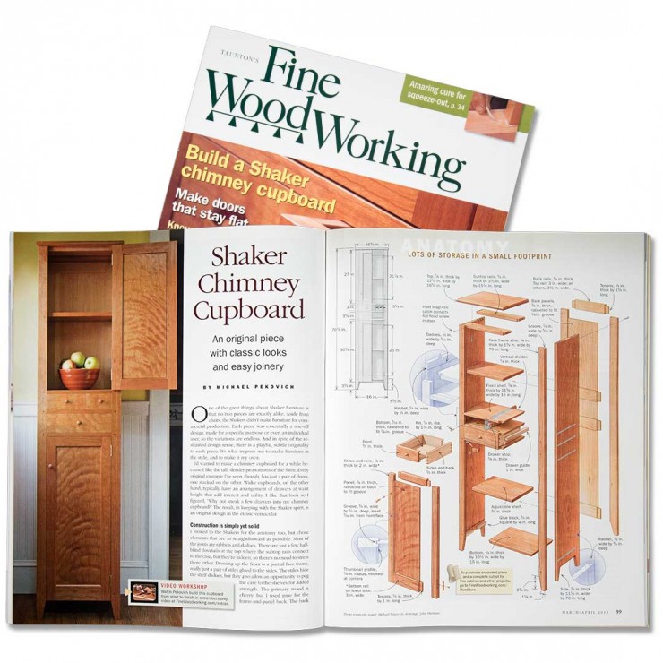
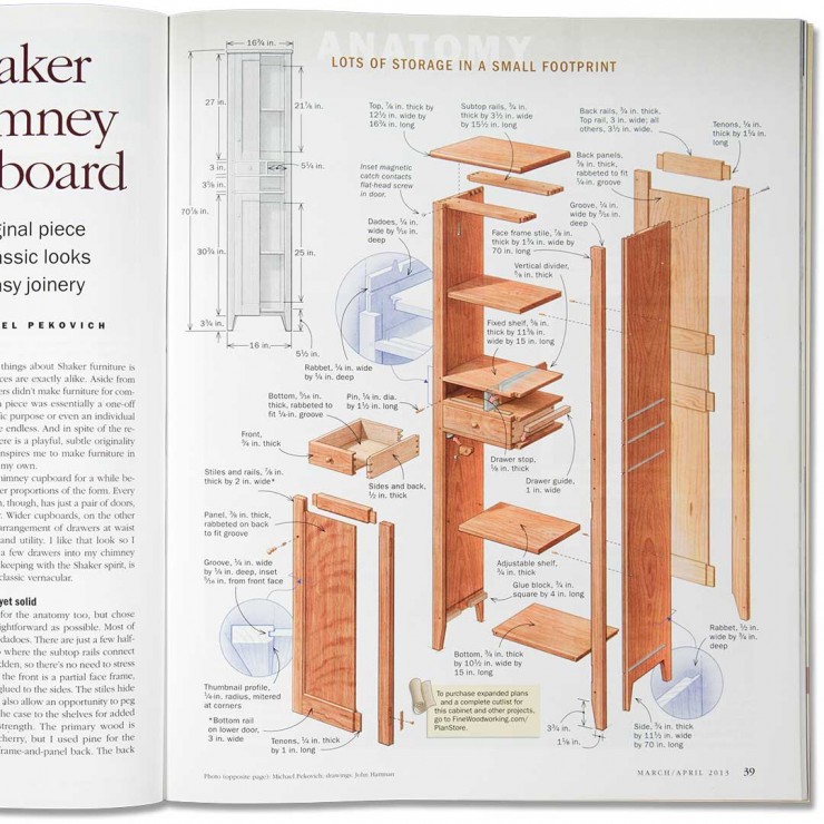
Illustration or art direction, which comes first? The above image is from an article in Fine Woodworking originally published in the April 2013 issue. Besides being an article about a beautiful cabinet it shows, in my view, what can go right when illustrators and and art directors work together to solve problems and also helps to answer the question “Where’s the Art in illustration?” I have been a freelance illustrator long enough to realize what it takes to create a great illustration for a magazine. And the answer may surprise you, its not just the skill and talent of the illustrator but the collaboration of both illustration, editorial and art direction all working together in concert to create a unified work of art. I have noticed that sometimes my illustrations don’t look as good when they are removed from the page. This is especially evident with exploded furniture drawings. The artful use of all of the page elements like art-text, body text, accessory drawings and photos that pull everything together that make the difference. Without these elements the shape of the drawing loses meaning and one misses the stabilizing contribution provided by the page design. This is why I have been photographing many of my illustrations in their native environment, it simply displays them at their best. This post is an analysis of what I think contributes to successful illustration and how best to use of illustration effectively within page design.
Where’s the Art in illustration?
I’m not a graphic designer but it is clear to me why this spread from Fine Woodworking works so well. And I have no doubt that the success of the magazine hinges on the exemplary efforts of Mike and his team. Let me list some of my thoughts on this design.
- The left page perfectly balances the right through the use of careful contrast. The left page has two vertical elements that are each symmetrical and reiterate the “look” of the subject piece of furniture. The purpose taken photo and the column of justified text capped with its center justified headline repeat the symmetry. These balance the diagonal movements of the exploded drawing.
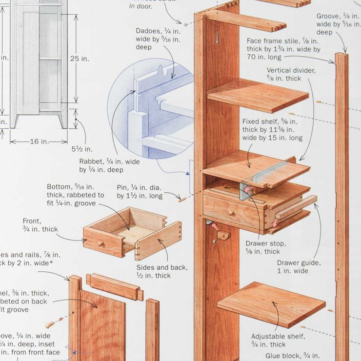
- The spread is further unified by the gray elevation drawing which reflects the photo, encouraging one’s eye to travel back to the head on the left. If this were rendered more densely the the effect would be lost. As it is, it joins the other light elements of the art text and accessory drawings. If you removed these and used white space instead, the design would fall apart. These lighter elements, which also provide useful information, work to glue the unruly edges of the drawing to the page. If they were rendered darker or in a bright color the balance would falter.
- Every part of the design has a purpose and is part of the whole balance. The small headline on the right page grabs just enough attention but clearly play second fiddle to the drawing. I particularly like the word anatomy peaking through the very light gradient in the background. Its one of the best uses of a toned background behind the illustration I have seen.
The whole is greater than the sum of its parts.
When It comes to successfully incorporating illustration into page design its not just a simple application of rules or the assembly of the disparate parts. Its not like putting together an Ikea bunk-bed. It takes craftsmanship and art, like building fine furniture. You can’t just gather together some nice fonts, a photo or two and an illustration and then sprinkle in a liberal amount of magical white space and expect anything great to happen.
While I don’t consider myself a qualified page designer, I have learned a lot from my experience with Fine Woodworking’s talented art directors. I have observed that there are certain characteristics and habits that good or great art directors have. First of all, good art directors are good communicators. They provide clear instructions about the illustration assignment, explaining what’s important and the goals of the illustration. They gather and provide reference material, or guide the illustrator to the right web source. This is essential to understanding what you will be drawing. There will be some indication of the scale of the illustration from the start and as the page design progresses changes are communicated to the illustrator. Its problematic to be told that the illustrations will be about 2 inches square only to find out after publication that they became 1/2 inch square.
Another feature of a good art director is that they embrace a collaborative creative work flow. They delegate responsibility to those working under them, both other art directors and even freelance artists like myself, all the while keeping a close eye on the project, making adjustments and suggesting changes. I know they get more from me by bringing me into the design process and even letting me make design suggestions. For example in this project it was my suggestion to use the satellite drawings in the circles.


